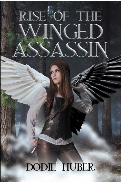
The final version of my cover art for Rise of the Winged Assassin has finally come in! Late Friday afternoon I received a text message form Page Publishing notifying me that there had been a change to my author portal. My heart immediately started to flutter. Questions raged through my mind. What will it look like? Would the changes I requested all be there? What would I do if the cover still needed work?
Page Publishing has been fantastic through this entire process, taking my feedback happily and working on it until I am completely satisfied, so I knew they would do it again if need be. The only thing is it takes about a month each time to get those changes back and it would make me sad to wait another month. I was willing to wait again if need be, but I hoped with everything that I had that I would not have to.
With my sister and daughter by my side I slowly clicked the link and tried to keep my heart from beating out of my chest. And here it is!

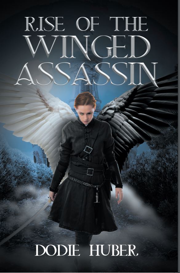
I happy cried with joy when I saw it. This cover was so much more than I could ever wish for. The first cover Page Publishing sent was so very different. They had taken my long document of comments and put together something that was almost there but needed changes. Lorelei lives in the forest so the background needed to be changed. I also wasn’t happy with the picture of Lorelei herself. She looked too young, not at all fierce like a warrior, and her outfit just wasn’t right. I remembered that my coordinator mentioned that I could look through all of their stock images and choose the ones that I wanted. So that’s what I did.
They had a great selection and I was able to find the background you see on the final cover. I also found the picture of the woman you are looking at. There were some alterations that she needed. She had elf ears, her sword wasn’t a katana, her pants had studs on them, that I requested to be removed, and of course her new wings had to be added. The artist accomplished all of that and even more. Take a look at the first cover and then the final cover for comparison.
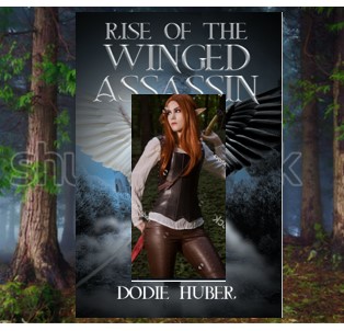
I really like this next comparison. When I went through Page Publishing’s stock art I took out my virtual kindergarten scissors and glue and pasted those images together to give the artist an idea of what I was looking for. When I saw the final cover, I noticed that her hair color was a more natural color of red than the picture I sent. Her face color was also more realistic and the lip color was toned down so it didn’t look like bright red amine lipstick. I don’t know how they do this but wow! The final cover everyting that I had hoped for!
Thank you Page Publishing for all you do!
Until Next Time. Write well and Prosper!
